Move through the summer heat to the water.
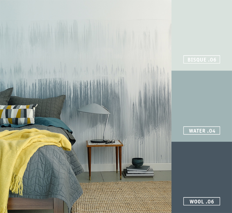
Layers of transparent blues create a cool and refreshing interior. Combine different shades of blue in the same space for a monochromatic look that mimics the gentle swells of the ocean with WOOL .06, WATER .04, and BISQUE .06.
In love with this Watercolor Wall technique? Learn how to do this simple DIY here.
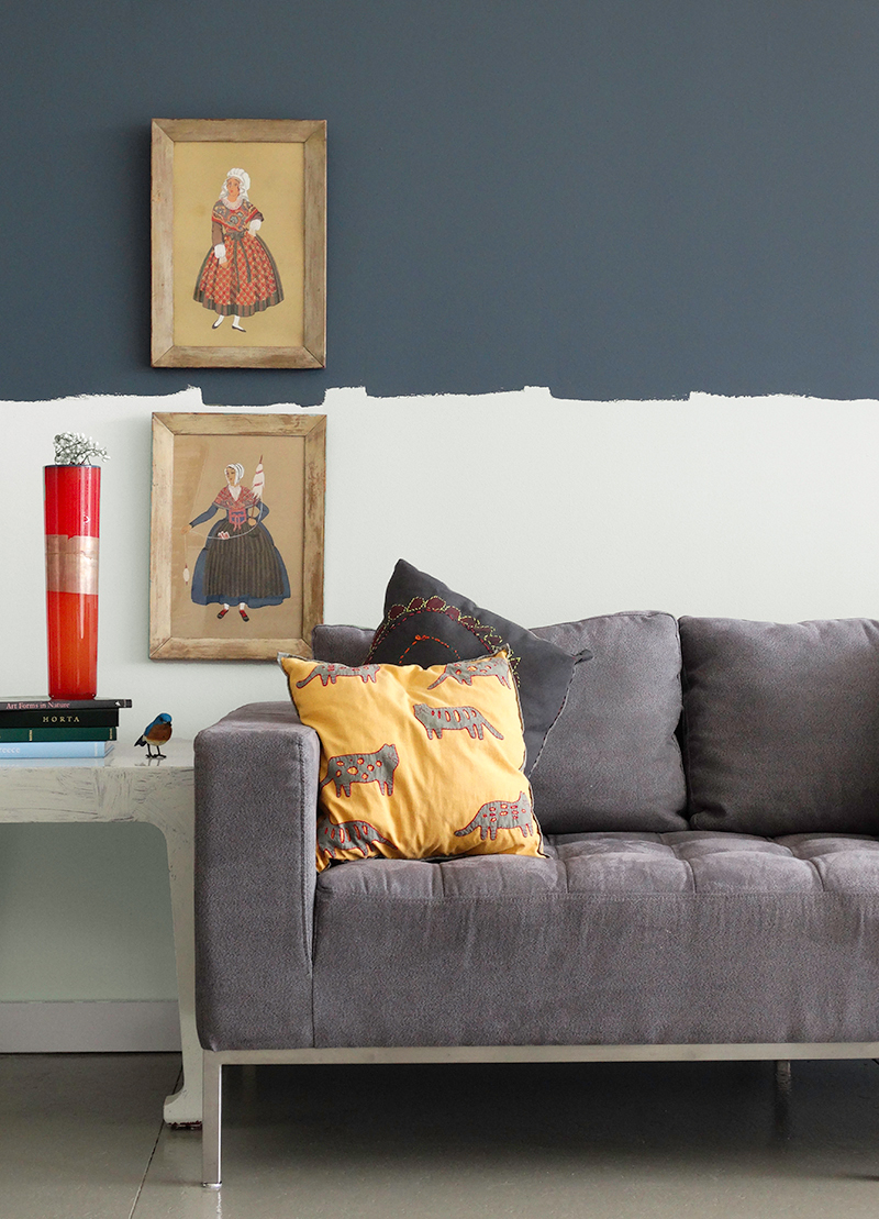
WOOL .06: A tweak on the classic navy. A drop of white makes this color softer and more livable. Partner with bright white on ceilings and trim for a more traditional vibe, or combine it with a modern couch like we did here for a contemporary twist on classic.
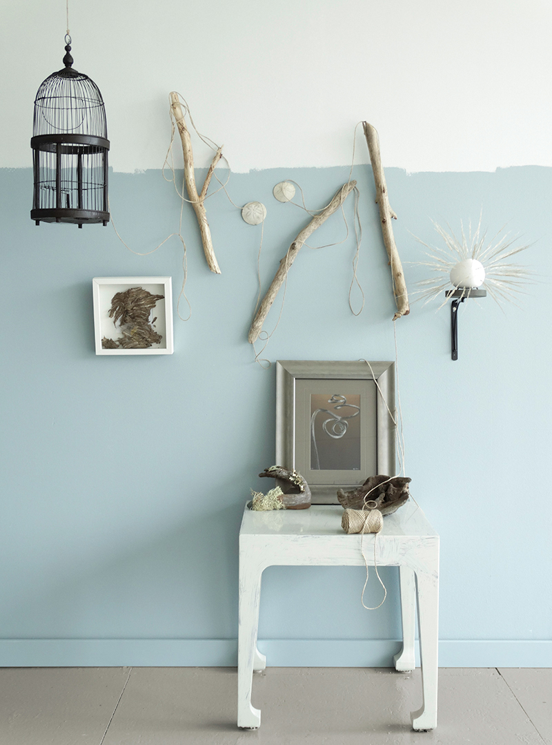
WATER .04: A medium blue that is not too cool. The color of sea and sky, this hue pairs perfectly with natural materials. Try using it as backdrop for your beachcombing treasures like driftwood, sand dollars, and beach glass.
BISQUE .06: A light grey with a touch of blue, this hue reflects the beauty of bisqueware - soft and powdery like unglazed pottery. Use this gentle hue in entryways and hallways, anywhere that you want to move easily through a space.
Want more blue inspiration? Find more ways to use this hue year round on our Summer Color Trends board on Pinterest.

Audrey
Love this but terrified to try it on my wall that we just painted since we moved in recently. Would this also work on a huge canvas so I could hang it like artwork?
Kim
Hi Audrey, Happy Painting!
You could absolutely do this technique on a canvas. Just follow our instructions and have fun, without the fear of messing up your fresh paint! The practice of doing that might give you the confidence to try it on your walls.